VIDEO TRANSCRIPT: Quilts stitch together data and community at Syracuse exhibit
Rachel Ivy Clarke: In 2010, I lived in Los Angeles, and I was working as a librarian. And I was really interested in information visualization.
Alexandra Petro: Rachel Ivy Clarke is an associate professor in Syracuse’s iSchool, but her work doesn’t live in spreadsheets.
Clarke: Essentially, it’s a compass rose.
Petro: It lives in quilts.
Clarke: One of the other things I love about quilts is the community aspect.
Petro: Instead of charts and graphs, Clarke uses art, like quilting, to communicate information to the public in a more tangible way.
Simcha Glassman: It’s a way for someone to communicate and express themself.
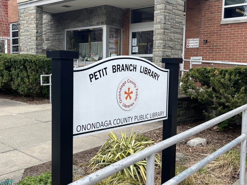
Petro: Clarke’s art is displayed at Petit Library, where others can see how she uses quilts to convey information.
Glassman: They could be touching on an important subject to them or just trying to communicate some kind of information.
Petro: Clarke designed the Quilted Information exhibit at this library. Each quilt translates a set of data into fabric, from Covid cases to travel.
Clarke: One is this one up here. This is the Coney Island Maker Faire, it’s what direction people travel from to the event determines the color of the fabric.
Petro: But Clarke says the goal isn’t just to display numbers; it’s to help people see data in everyday life.
Clarke: Seeing that a-ha moment that people have when you’re like, quilts are always about data.
Petro: Clarke says the colors, the shapes- even the memories in the fabric- can tell a story.
Clarke: People will be like, “Oh yeah, I have a quilt and it’s made from all of my grandmother’s old dresses.” And I’m like, “That’s data.”
Petro: She hopes projects like this make people think twice about what information can mean.
Clarke: This is data, and that just looks like a pretty pattern. It’s not information until you understand what it is.
Petro: In Syracuse, Alexandra Petro. NCC News.
SYRACUSE, N.Y. (NCC NEWS) — An exhibit at Petit Branch Library transformed complex data into vibrant quilts, offering a novel approach to information visualization through textiles.
Rachel Ivy Clarke, an associate professor at Syracuse University’s School of Information Studies, designed the Quilted Information exhibit to translate datasets into fabric, making abstract numbers tangible and accessible.
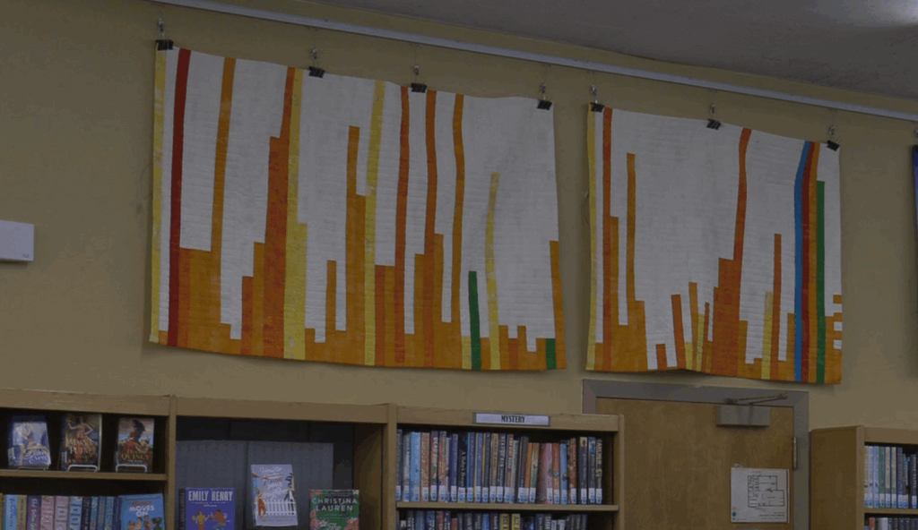
Clarke’s quilts, displayed through May 2025, conveyed data ranging from COVID-19 case rates to travel patterns at maker faires. Each piece used color, shapes and stitching to encode information, challenging traditional notions of data as confined to spreadsheets.
“This is data,” Clark said. “That just looks like a pretty pattern. It’s not information until you understand what it is.”
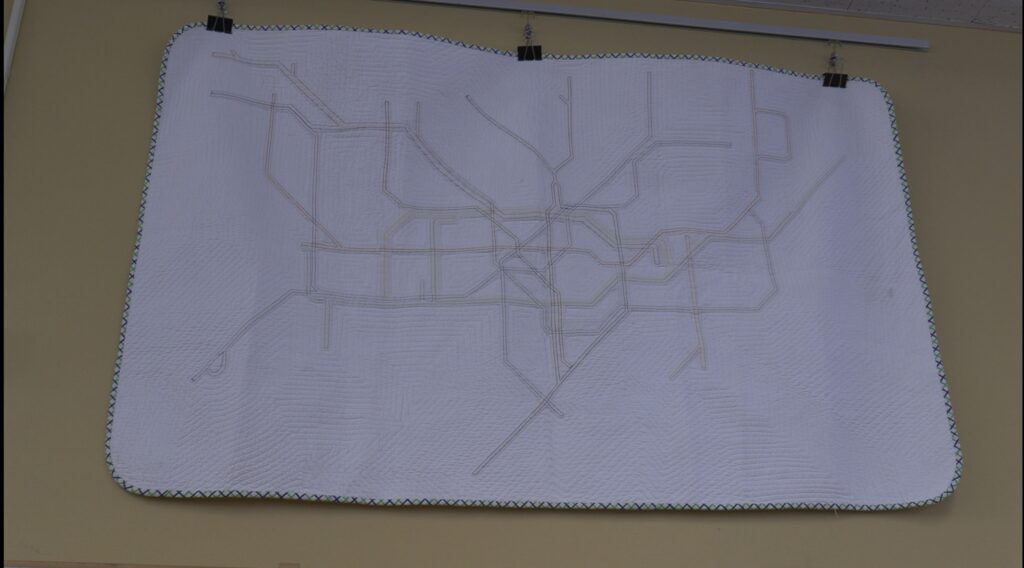
Clarke’s work began in 2010 while living in Los Angeles, where she worked as a librarian at the Fashion Institute of Design and Merchandising. Inspired by iconic visualizations like the London Tube map, she combined her love of library science with textiles.
“I was really interested in information visualization,” Clarke said. Her first quilt for the exhibit reimagined the Tube map’s design in fabric, marking the start of her exploration into data-driven quilting.
The exhibit’s centerpiece, a quilt inspired by the Coney Island Maker Faire, mapped attendees’ travel directions and distances. Orange fabric represented north: yellow, west: green, east: red and south: blue, with strip lengths corresponding to miles traveled.
“It’s what direction people travel from to the event that determines the color of the fabric,” Clarke said.
The quilt also featured stitched silhouettes of Coney Island’s roller coaster and Ferris wheel, blending artistry with precision.
Simcha Glassman, adult services librarian at Petit Library, emphasized that art, like Clarke’s quilts, communicates complex ideas subtly.
“It’s a way for someone to communicate and express themself,” Glassman said. “They could be touching on an important subject to them or just trying to communicate some kind of information.”
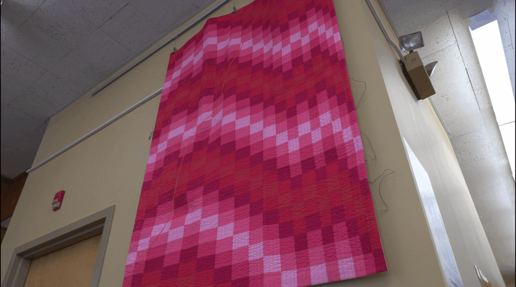
Another quilt, which Clarke titled “Magenta Muerta,” juxtaposed the Pantone Color of the Year for 2023, Viva Magenta, with COVID-19 incidence rates from January to May 2023. Clarke chose the vibrant hue to highlight the ongoing pandemic’s toll. The quilt drew data from the Centers for Disease Control and Prevention, which reported approximately 2.5 million new cases nationwide during this period, ending in May 2023, when the agency ceased official data collection.
“I really wanted to take this color and make this statement about how this is still happening,” she said.
Clarke’s quilts also pushed boundaries of what constitutes data. A quilt resembling a QR code checkerboard compiled community-submitted squares, each reflecting personal data. Another used a compass rose design to map travel, with rings in inches representing miles.
“There’s eight cardinal directions that we drew colors from to make these quilts,” Clarke said.
The exhibit invited reflection on data’s role in art and history. Clarke cited the Quilt Index, an online database documenting quilts’ cultural significance, and wondered about her work’s future interpretation. On display through May 2025, Clarke’s quilts blend artistry with precision to reframe data as accessible storytelling.